When it comes to selecting a font for your signage, you need to consider more than your branding. The wrong font can make signs difficult to read and hard to see from a distance. It can also mean that your signs stand out for the wrong reasons, failing to grab attention or successfully entice customers into your business premises.
Taking time to find the right font can help ensure your signage is easy to spot, says the right things about your brand and is effective in helping to build your business. So how do you choose a great font and what should you avoid?
Why do you need to consider signage fonts?
The font you use in your signs can say a lot about your business, even if people reading them don’t consciously make connections. Fonts create a certain style, personality and delivery so the same message in two different typefaces can have totally different effects.
Even if you’re just using block capitals throughout your signs, there are hundreds of font options and each of these will look and feel different to customers.
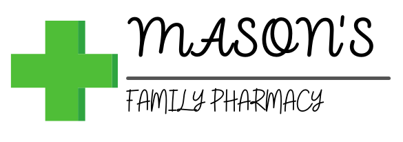
For example, this pharmacy sign uses a clear font that is easy to read and creates a clean, professional feel – exactly what you want from a business providing medical support.

If the font is changed, it can change the feel of the sign:

This font is harder to read, despite it being the same size and still in block capitals, and doesn’t have the same professional feel. It is less likely to make someone trust the business, which will have an impact on footfall.
It’s easy to create the wrong impression with the wrong font, which is why you should consider it a key part of your signage’s design.
What is the best font for signage?
No one font is the best overall font for signage. What works for one business won’t necessarily work for another as they will want to create a different brand and portray differing messages.
However, some fonts tend to be stronger than others when it comes to business signage.
- Century Gothic: This font is easy to read, especially from a distance, which has made it a popular option for signage. It’s lightweight, wide characters create an open and balanced look. Century Gothic Light looks particularly classy and modern.
- Gotham: Gotham is a modern geometric font based on Futura (another good choice). It is clean, legible and sophisticated. A great choice for clear messaging and wayfinding signs.
- Garamond: The Garamond group of fonts are ideal for smaller text on signage as they are very clear and easy to read. There’s a reason they’ve been around since the 16th Century!
- Memphis: A Geometric Slab Serif font from the ’30s, Memphis is a bold clear and constructive font, a touch more decorative than a sans serif font. Would look good on pub signs, or restaurant signs.
- Din: Designed by an engineer rather than a designer, Din was created for road signs in Germany. As such it’s perfect for directional signage and traffic signs. It has a technical, compact look, and in bold has a good surface area for bright illumination.
While these aren’t the only fonts that are ideal for signs, they do all have one thing in common: they are easy to read. That is the most important part of your signage’s font. You can then start to consider the branding and what you want to say with your signs.
There are also technical/manufacturing considerations regarding fonts too, which is where our expertise can help you. Whereas anything goes for print, vinyl and flat cut letters, serif fonts and script are more difficult as built-ups, and as such range from more time-consuming in manufacture (and therefore more costly) to almost impossible, dependant on style and stroke width. Sans Serif fonts create a much more even illumination, so look fantastic as face lit or halo lit letters. Narrower stroke widths also suit block acrylic letters better, for example.
What is the worst font for signage?
Just as there are a lot of good fonts to choose from, there are plenty that you should steer clear of when creating your signage. Whether it’s because they are difficult to read or have negative associations, using the wrong font can be an expensive mistake to make.
It’s generally a good idea to steer clear of these fonts when it comes to business signage:
- Comic Sans: In general, you should avoid using Comic Sans for anything business-related as it is seen as one of the least professional. While it’s easy to read, it has a lot of negative connotations that you don’t want to be associated with a business.
- Curlz: Only very specific businesses – such as hairdressers – might get away with using a font that has curling ends, although there are plenty of better options out there. The font is fairly cartoonish and immature, which isn’t the best impression to create.
- Arial: This font is incredibly easy to read, which is why it is a popular choice for books and websites. It’s a standard font, which is why it isn’t ideal for signs as it doesn’t stand out enough. It is worth noting, however, due to its excellent legibility, that it is a worthy choice for wayfinding in an industrial / business park setting, unit numbers for example.
- Brush Script: Brush Script is a bad choice for two reasons – it’s hard to read and it’s difficult to match other fonts with. You’re better off choosing a simpler option that will work well with other fonts you may need to use throughout your business.
- Mistral: Script fonts can be elegant and eye-catching, but they can also be difficult to read. Mistral is one of the worst offenders as it is difficult to make out and people aren’t going to want to spend time trying to work out what your sign says.
How do I choose a font for my sign?
When choosing a font for your sign, you want to make sure it is clear, easy to read, doesn’t take a lot of time to decipher and can be seen from a distance. Starting with these points can help you create a great shortlist of fonts.
You can then start to look for a font that matches your brand and what you want to say about it, as well as the type of business you have. This can be something more fun and playful or you can keep it ultra-professional.
Finally, you should look at complementary fonts. Often, your business name is in one font and then a secondary font is used for any other messaging. If this is the case, you want all of the text to work together and still follow the above rules.
If you’re struggling to find the best font for your signage or need some help with the overall design and best practices, we’re happy to help. We’ve got 35 years of experience in helping businesses stand out with their signage, working with some of the biggest companies in the UK.
To find out more about how we help you create the right impression with your signs, give us a call today on 0115 976 1188 or email us at sales@geeteesigns.com.

