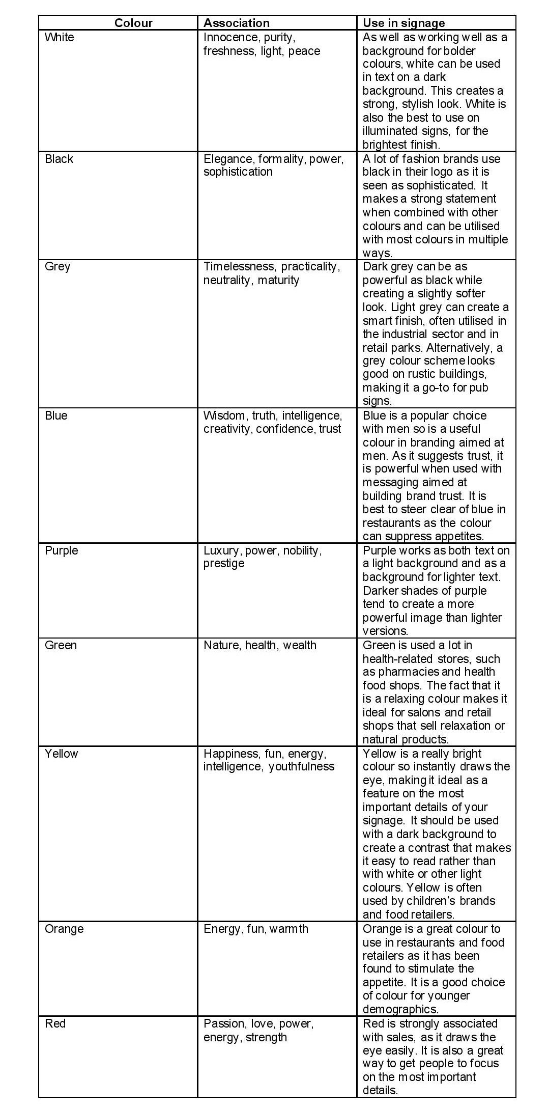
Colour can make a huge difference to how people feel and react. A single colour or a combination of colours can make people feel happy, sad, relaxed or agitated and can even affect the way that food tastes. This is why you need to take colours into consideration when designing your business signage.
Marketing has used colours to communicate different messages and create different feelings for decades. A great example is Cadbury’s Dairy Milk, which comes in a purple wrapper that was designed to create the impression of sophistication and luxury. This message wouldn’t have been the same if the wrapper was orange, pink or green.
When it comes to signage, colour can help to express your brand’s values and help customers feel a certain way when they interact with your brand. This is why the right colours can make all the difference. So, how do you choose a colour for your signs that makes the right impression and helps them stand out?
What do different colours mean?
To start with, understanding what emotion or imagery certain colours stir up can help you assess which one works best with your brand. It can also allow you to choose different colours for different types of signage in order to influence the full customer journey.
Can you combine colours in signage?
If you have different messages that you want to portray with your signs, it makes sense to consider using different colours to do this. However, combining colours in signage is not an exact science so does require some care.
Rather than trying to get one sign to put across too many messages, you want to be sure to focus on the primary message – the one that you want people to notice straight away and that you want them to feel a certain way about. A great way to do this is to use different shades of a base colour, such as a mint green with a forest green. This will help you put a strong message across while creating an attractive sign that customers will notice for the right reasons.
If you want to create an impression of two different messages – such as trust combined with fun – a complementary colour scheme could be a good idea. This is when you combine a cooler colour like blue, with a warmer colour like yellow or orange. A sign like this will be bright, easily noticeable and help to create different feelings. Even better, you can add neutral colours like black and white in without upsetting the balance or feeling.
Colours are about persuasion as well as brand
It’s important to remember that while the colours you choose across your business signage will say something about your brand, they should also be used as a means of persuasion. Your signage should give customers a nudge to behave in a certain way, such as making a purchase or enquiry.
Utilising the psychology of colour across your signs can help you do this in a subtle way that still works with your branding.